For a social network so linked to images, Instagram was starting to get old. After a long work, its interface has nevertheless been modernized, as well as its logo.
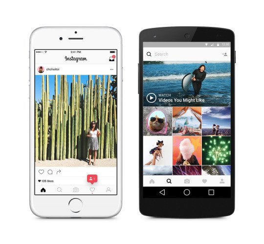
Instagram today announces the launch of its new look, younger and closer to current standards. The first difference is in the logo. It abandons the skeuomorphism of the old-fashioned hipster Polaroid camera, to settle for a simple minimalist representation in white lines on a very colorful gradient background, somewhat reminiscent of the transition to iOS 7 in 2013 where the plus or less realistic have given way to representations as vivid as they are simplified by Sir Jony Ive. In the same vein, Instagram has also updated the icons of its Layout, Boomerang and Hyperlapse applications.

Of course, the very heart of the application has also been modified in order to refresh its menu. The massive black bar that previously displayed the navigation elements gives way to its white equivalent, which is smaller and more discreet. The logos (the welcome house, the search magnifying glass…) have also been slightly reduced and are clearer, only lighting up to signify that the category is currently active. We can note other changes, such as the search field which clears up in the same way, abandoning blue for white.
Already available on iOS, this new version of Instagram does not seem to be deployed on Android yet, but should soon arrive on the side of Google's green robot.

To read
Instagram is testing accounts dedicated to professionals


