They are about to arrive new Windows 10 icons, those consistent with the so-called “Fluent Design“. The first renewed icons have already been inserted into the Build 19569.1000 di Windows 10 Insider Preview, that is the version of the operating system that Microsoft makes test members of the Insider Program.
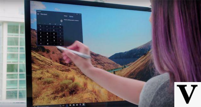
The new icons inserted by Microsoft in this build are those of the Alarms and Clock, Calculator, Mail and Calendar apps. They have a more three-dimensional look and new colors, and will be the same on all versions of Microsoft's apps for all operating systems: even Android, iOS and macOS. Thus, Microsoft is trying to carry out its project Fluent Design System, heir to Microsoft Design Language 2, born in 2017. The characteristics of this design are contained in five key components: light, depth, movement, material and scale, which feature Microsoft's app icons on all operating systems. Goodbye, therefore, to the old flat and monochrome icons that, in the days of Windows 8, Microsoft praised as the best in the world.
Microsoft Fluent Design: what it is
Fluent Design is, first of all, a move to rejuvenate the image of Microsoft, its operating systems and its apps. This is a project that Microsoft defines as open source, because it is open to external contributions. On the page dedicated to Fluent Design on its website, however, Microsoft already has a lot of material ready to "direct" developers to follow Fluent Design: code examples, toolkits for the main graphics programs, buttons and commands ready to be inserted in apps and more.
Microsoft Fluent Design: what it is for
Many will wonder why Microsoft, instead of thinking about making updates that work, is spending time and resources in creating a new design for icons and apps. The answer was given by Christina Koehn, the woman at the head of the Microsoft design team: “Put simply: we have evolved. Our ecosystem experience is incredibly complex and has started to spread from Windows to third-party platforms such as Android, iOS and Mac. We are committed to making our icons familiar, beautiful and inclusive in the modern phenomena of multi-platform and cross-device experiences. " . And, if it wasn't clear yet, Koehn adds: “Adding color also offers a consistent design language across all platforms - the icon that's familiar in Windows 10 is the same on Android, iOS, and Mac, providing an orientation path through your digital life “.
New Windows 10 with Fluent Design: what changes


